
The most famous picture of Earth is a con. Not a malicious one. More like an honest tool that got promoted way past its job description.
In 1569 Gerardus Mercator drew a chart for one customer: the sailor. On his map a fixed compass bearing runs dead straight, which in the sixteenth century was worth more than gold. The catch is baked into the maths. To keep those bearings straight the map has to stretch the world as it leaves the equator, and it stretches area fast. At 60 degrees latitude everything is drawn four times too big. Greenland gets blown up roughly tenfold. The poles it can’t show at all, because the projection runs off to infinity before it gets there.
That chart is now your classroom map, your news graphic and, until 2018, your Google Maps. Google adopted Web Mercator in 2005 and only switched desktop users to a globe view thirteen years later.
The flattered
- Greenland, drawn like a continent at ten times its true size
- Canada and Russia, both genuinely vast, both drawn vaster
- The UK, inflated nearly threefold where it sits
- Alaska, which looms over the map like half of America
The robbed
- Africa. 30 million km² of land. Fourteen Greenlands. The USA, China and India fit inside it together, with room to spare. On the wall map it reads as medium.
- Brazil, Indonesia, India, the Congo. The entire equatorial belt, drawn honestly and therefore looking modest next to the inflated north.
Spot the pattern. The map flatters the top of the world and shortchanges the middle. People have noticed. There’s a whole episode of The West Wing about it, and in 2017 Boston’s public schools made headlines by switching their classroom maps to an equal-area projection.
Catch it red-handed
Arguments about projections are boring. Drags are not. Open this scene and run three experiments:
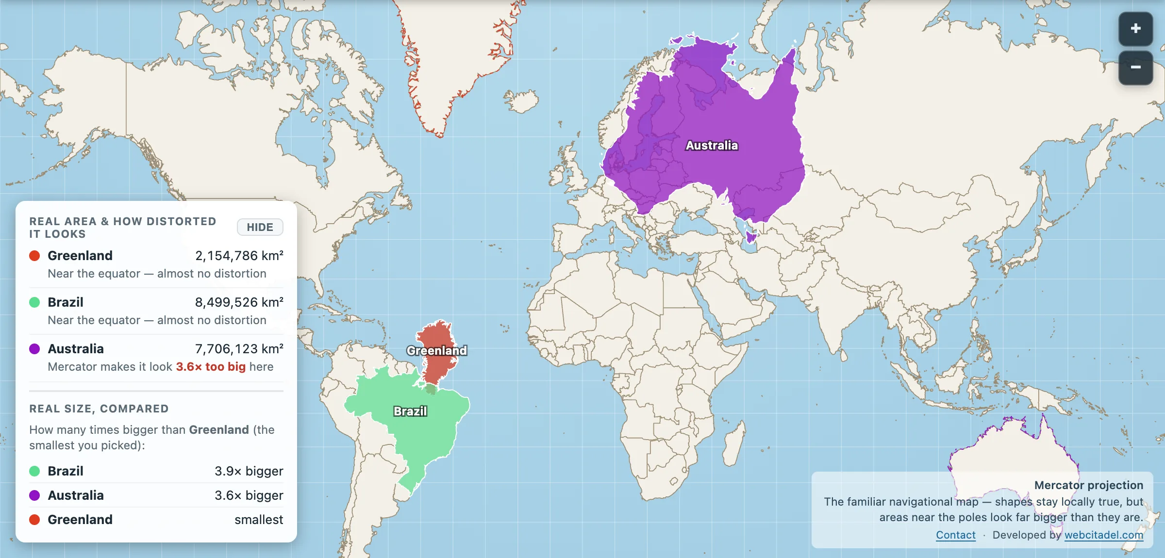
- Pull Greenland down to Brazil. It shrinks to a quarter of the country you were told it rivalled.
- Shove Australia up to Russia’s latitude. Watch a normal-sized country turn into a monster in front of you.
- Flip to Equal Earth or the globe. Same planet, no costume.
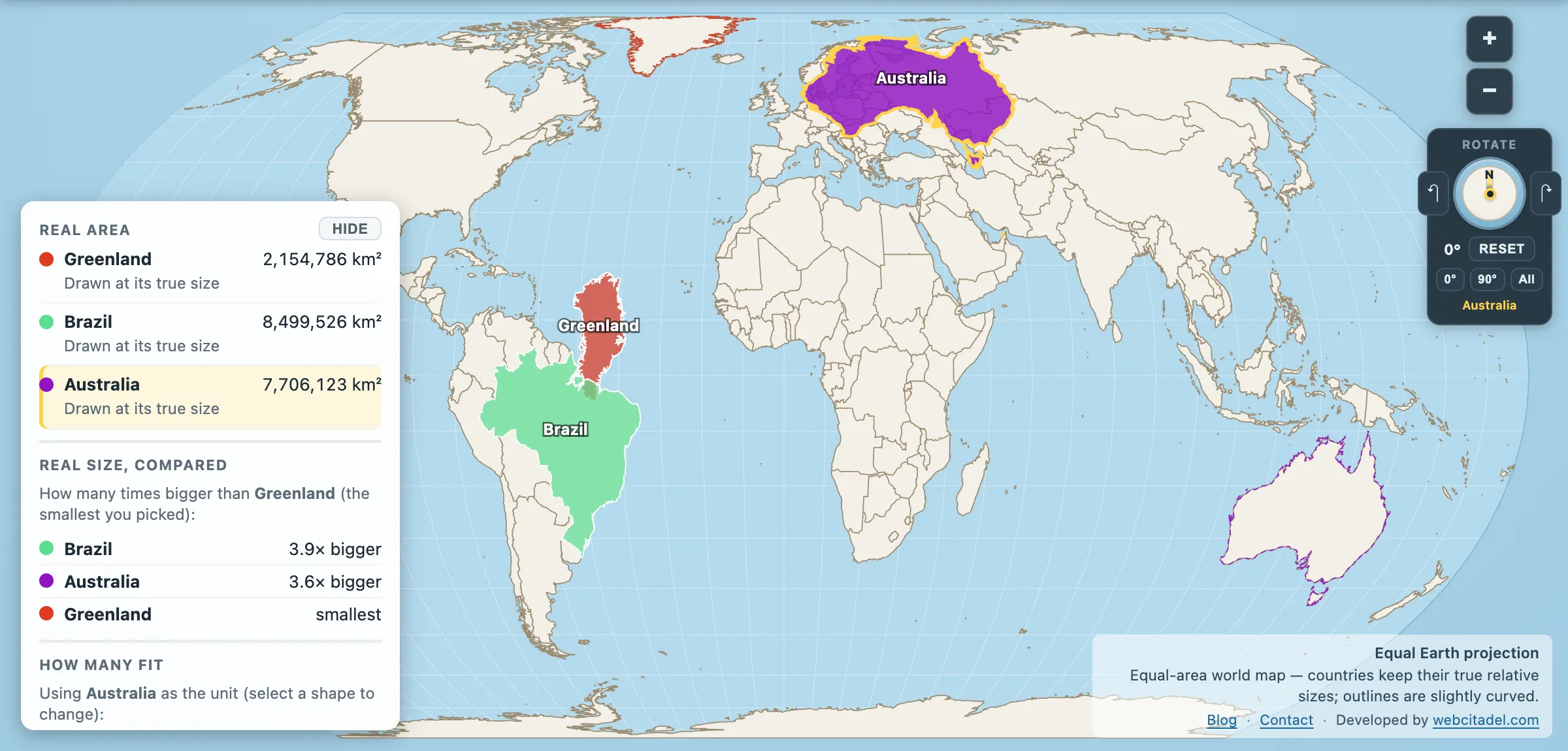
The same shapes on Equal Earth, where every square kilometre is drawn the same size wherever it sits. This is the honest version.
Keep the old man on
Mercator doesn’t deserve the bin. For navigation and street-level maps it’s still the right call, because locally the shapes behave and north stays up.
Just never ask it which country is bigger. It’s been getting that one wrong, with total confidence, for four and a half centuries.