
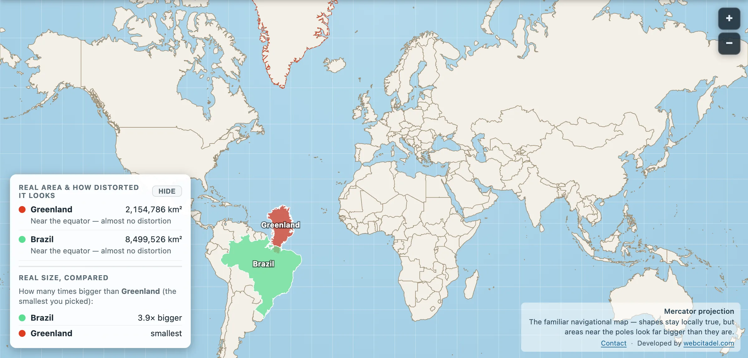
Let’s start with what you think you know. There’s a map in your head. Been there since school. And on that map Greenland is massive, a great white slab lording it over the top of the Atlantic, roughly the size of South America.
Now the numbers.
Greenland: 2,154,786 km². Brazil: 8,499,526 km².
Brazil is 3.9 times bigger. You could drop Greenland into Brazil almost four times and still have room for the queue at the airport.
The victim was framed
Greenland is genuinely big. Largest island on the planet, though still not a continent, which is its own story. Almost exactly the size of Saudi Arabia. About 80 per cent of it sits under an ice sheet up to three kilometres thick. Population: roughly 56,000 people, which is a decent football stadium. Brazil has 213 million people, borders ten countries and takes up nearly half of South America.
So why does the map put them in the same weight class?
Because in 1569 a Flemish cartographer named Gerardus Mercator built a map for sailors, and sailors don’t care about area. They care about bearings. Mercator’s projection keeps a compass course as a dead straight line, which is a beautiful trick, and it pays for that trick by stretching everything as it moves away from the equator. By the time you reach Greenland’s latitude the stretch is running at roughly ten to one.
Ten. To. One.
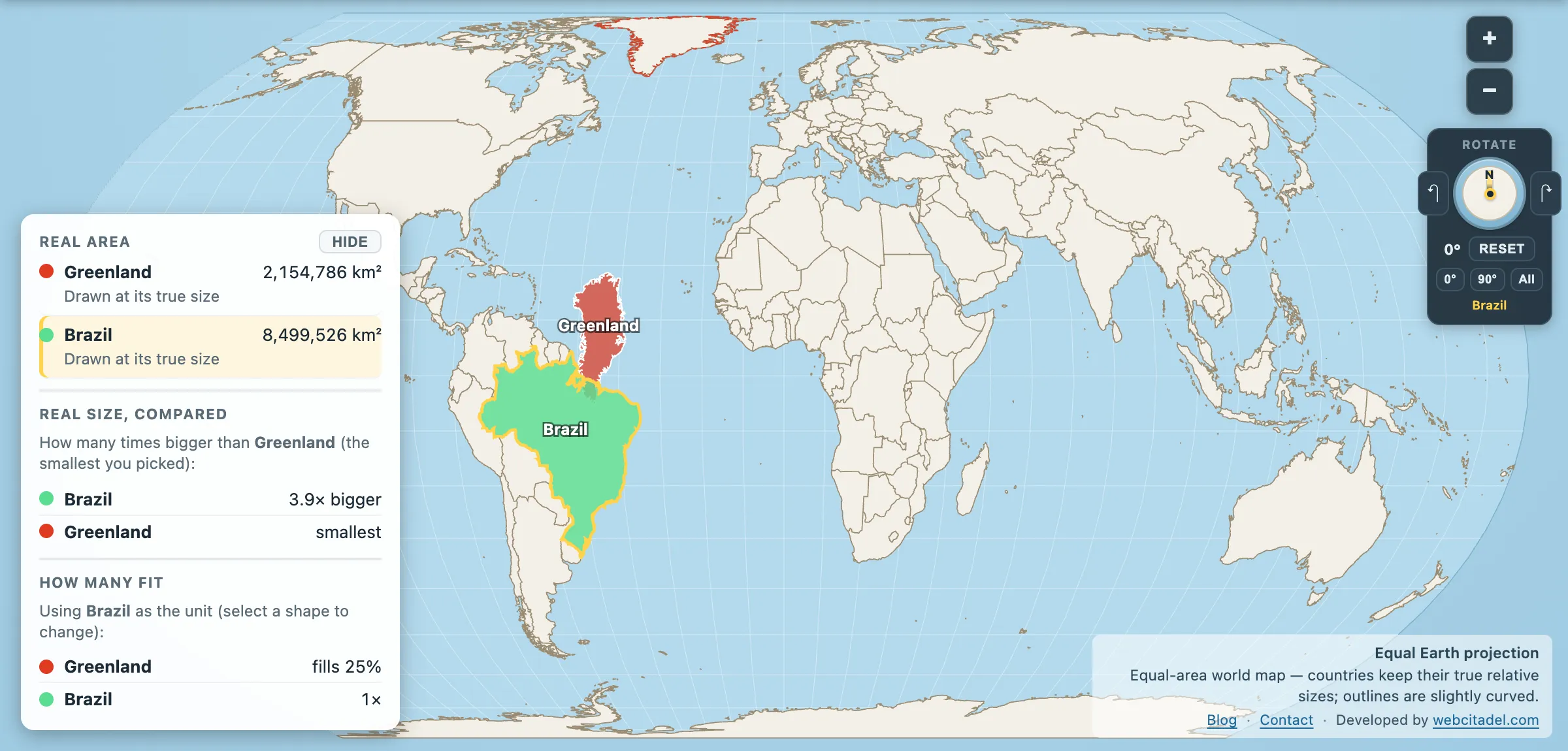
The same shapes on Equal Earth, where every square kilometre is drawn the same size wherever it sits. This is the honest version.
Watch it happen
Here’s the bit no poster can do. Open Greenland vs Brazil and drag Greenland south. Watch it deflate as it travels. By the time it parks next to Brazil it’s told you the whole story without a single word: same island, same area, different latitude. The map was never measuring Greenland. It was measuring where Greenland happened to be standing.
Then flip the projection to Equal Earth or the globe and see the honest version.
One drag. That’s all it takes. And you’ll never look at the classroom map the same way again, which frankly is the point.