
You’re four hours into a flight from London to Tokyo, you open the seat-back map, and the aircraft is over the Arctic Circle heading for the top of Siberia. Tokyo is south-east of London. The plane is going north-east. Nothing about the picture makes sense.
The plane is flying the shortest possible route. The map is lying to you, and it’s the same lie the rest of this site is about.
Straight lines on a ball
On a flat surface, the shortest path between two points is a straight line. On a sphere, it’s an arc of a great circle — a circle whose centre is the centre of the planet. The equator is one. Every line of longitude is one. Lines of latitude, apart from the equator, are not.
Take a globe and a piece of string. Pin one end on London, the other on Tokyo, pull it taut. The string runs up over Scandinavia and across the Arctic edge of Siberia. That’s the great circle: 9,591 km.
Now fly the route that looks straight on the wall map instead — hold one bearing and head east across Europe, Central Asia and China. That’s 11,345 km. You have just added 1,754 km, nearly a fifth again, by trusting the picture.
Now flatten that globe. The taut string, transferred to a Mercator map, becomes a curve arcing towards the top of the page. The path didn’t bend. The paper did.
Rhumb lines, and the reason Mercator exists at all
There is a route that is genuinely straight on a Mercator map: the rhumb line, or loxodrome, which crosses every meridian at the same angle. Hold one compass bearing and you’re on a rhumb line.
That is precisely what Mercator built the projection to do in 1569. A navigator with a chart, a ruler and a compass could draw a line, read off a single bearing, and sail it for weeks. On a sphere that path spirals slowly toward the pole and is not the shortest way anywhere — but it was the only kind of route a sixteenth-century ship could actually hold. Mercator traded distance for simplicity, and for four centuries at sea it was the correct trade.
Aircraft don’t make that trade. With modern navigation you can fly a continuously changing heading, so you fly the great circle and take the shorter distance. Which is why the seat-back map, still drawn on a flattened projection, shows an arc.
The same reasoning explains routes that look outright perverse, and the penalty for ignoring it grows with distance:
- New York to Hong Kong goes over the Arctic, not the Pacific. Great circle 12,970 km; hold a single bearing instead and it’s 17,783 km.
- Santiago to Sydney dips deep towards Antarctica. Great circle 11,341 km — against 20,543 km on a constant heading. The map’s “straight” route is very nearly double.
- Johannesburg to São Paulo looks like it’s overshooting south. It’s within about a hundred kilometres of optimal, because near-east–west routes at similar latitudes are the one case where the two nearly agree.
Where the routes deviate from the great circle, it’s usually not geometry doing it — it’s the jet stream (worth a substantial time saving eastbound), airspace restrictions, ETOPS rules governing how far a twin-engine aircraft may be from a diversion airport, or fuel prices making a slightly longer route cheaper.
The same maths this whole app runs on
This is not a side note for Map Real Size. It’s the engine.
When you drag a country across the map here, every vertex of its outline is re-placed by its great-circle distance and bearing from the shape’s centre. That’s what makes the shape keep its true size as it moves — it’s being moved rigidly across a sphere, not slid across a rectangle. The naive alternative, just adding degrees to latitude and longitude, inflates Greenland’s true area by getting on for 280 per cent as it approaches the equator, which would make every comparison on this site worthless.
Aircraft navigate on great circles. This map drags on great circles. Mercator draws neither of them straight.
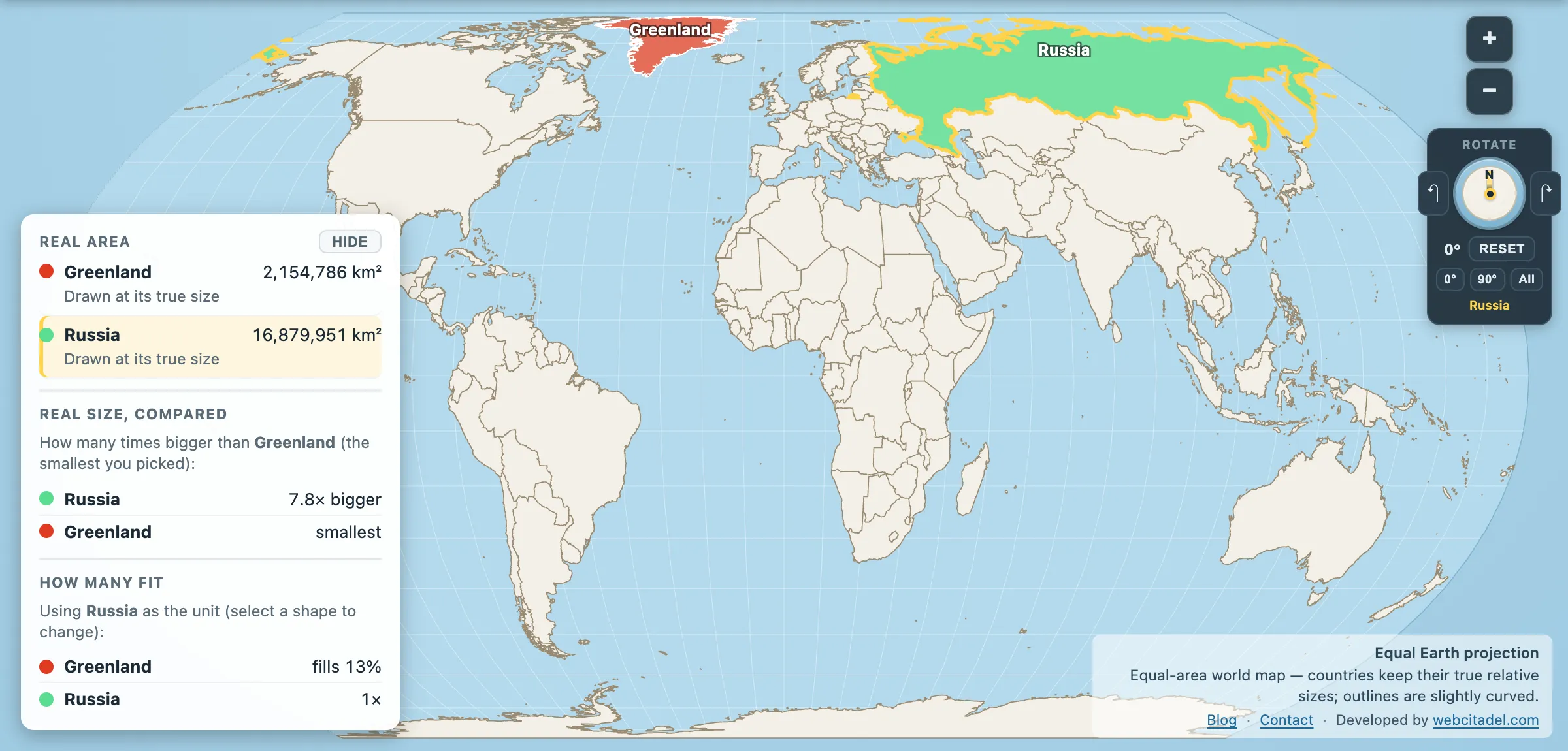
The same shapes on Equal Earth, where every square kilometre is drawn the same size wherever it sits. This is the honest version.
See it on a sphere
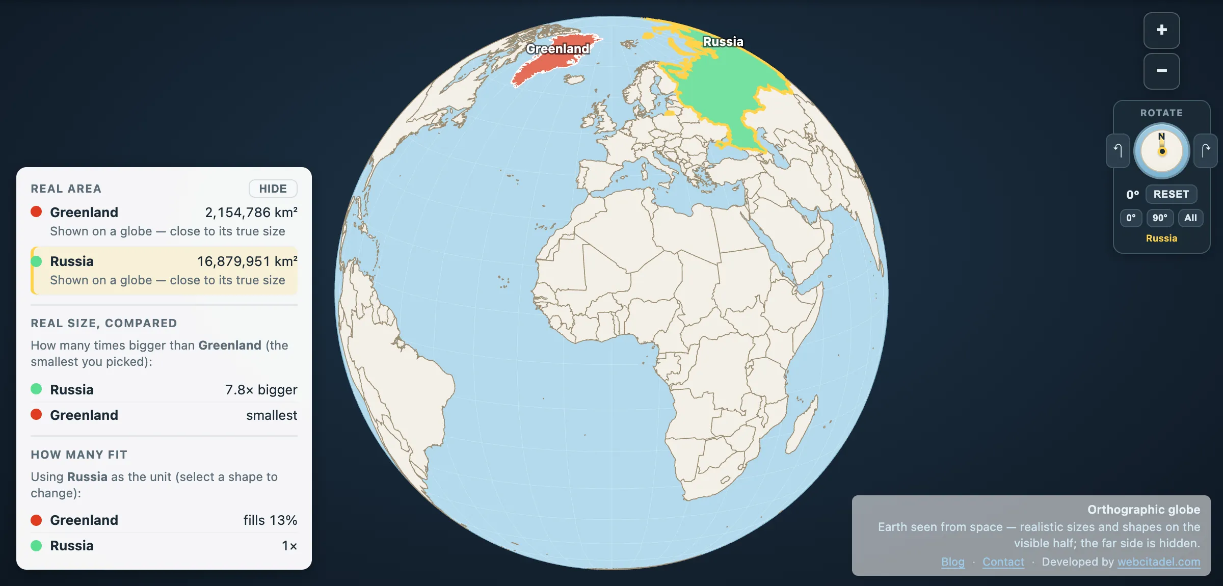
Open the globe view and spin it by dragging the ocean. Look down at the Arctic from directly above and the geography of the northern hemisphere rearranges itself: London, Tokyo, New York and Beijing are all much closer to each other over the top than any flat map suggests, and Russia and Canada are practically neighbours.
Then switch to Mercator and watch that entire region get stretched into the top of the page — the distortion that makes Greenland look bigger than Brazil and flatters every country in the far north.
The Arctic is not the edge of the map. It’s the middle of the busiest shortcut in aviation.