
Most arguments about maps are arguments about what’s on them. This one was about the shape of the paper, it ran for the better part of thirty years, and it ended with the professional cartographers of an entire continent signing a formal resolution telling publishers to stop.
What Gall–Peters actually is
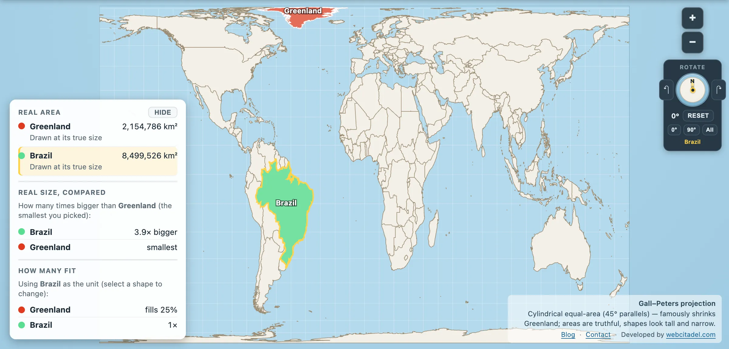
It is a cylindrical equal-area projection. Every country is drawn at its correct relative size — which is why, on it, Africa is finally the size Africa actually is.
The cost, and Gauss’s theorem guarantees there is one, is shape. Everything near the equator is stretched vertically into a tall thin version of itself; everything near the poles is squashed flat. Africa and South America look elongated, as if the map had been left in the sun.
The projection was described by James Gall, a Scottish clergyman, in 1855, and went essentially unnoticed. Then in 1973 Arno Peters, a German filmmaker and historian, presented it at a press conference in Bonn as a new and fairer map — arguing that Mercator’s inflation of the northern latitudes was a piece of European self-flattery that had shaped how the world thought about everywhere else.
Why cartographers reacted the way they did
The political argument landed. Aid agencies, churches and development organisations — UNESCO bodies, UNICEF, Christian Aid and others — adopted the Peters map in large numbers over the following two decades.
Professional cartographers were, to put it mildly, less enthusiastic, and their objections were of three kinds. First, it wasn’t new — Gall had published it 118 years earlier, and the presentation of it as original grated. Second, the specific claims made for its accuracy were overstated; it is one equal-area projection among dozens, and the parallel it stands on is a design decision rather than a discovery. Third, and most substantively, the shape distortion is severe, and other equal-area projections — Mollweide, Eckert IV, later Equal Earth — deliver honest areas without making continents look like they’ve been ironed.
In 1989 and 1990, seven North American geographic organisations, including the American Cartographic Association and the National Geographic Society, adopted a joint resolution urging publishers and the media to stop using rectangular world maps altogether — Mercator and Gall–Peters rejected in the same breath. Rectangular maps, it argued, show a round Earth with straight edges and sharp corners, get most distances and direct routes wrong, and turn a curved coordinate system into a squared grid.
Not everyone signed. The North American Cartographic Information Society declined to endorse it, on the reasonable ground that telling people which projections they may not use is its own kind of overreach.
Which is the satisfying twist. The establishment’s answer to Peters was not “Mercator is fine”. It was “you’re both wrong, stop using rectangles.”
The West Wing scene
For a lot of people the whole controversy arrives via a single television scene. In The West Wing episode “Somebody’s Going to Emergency, Somebody’s Going to Jail” (2001), lobbyists from the Organization of Cartographers for Social Equality pitch the White House on switching the nation’s classrooms to the Peters projection, and flip the map upside down for good measure.
Worth knowing: the organisation is fictional, invented for the episode. The projection, the argument and the size distortions are entirely real, and the scene is a fair summary of Peters’s case — minus the reply from the cartographers, which the format didn’t have room for.
In 2017 Boston Public Schools announced a switch to Peters maps in some classrooms, generating a fresh round of the same headlines and the same replies, forty-four years after the press conference.
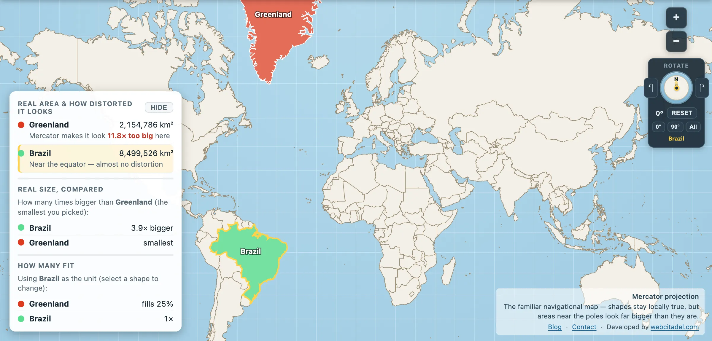
The same shapes on Mercator — the projection almost every map you see uses. Watch what it does to anything far from the equator.
Judge it yourself
Open Mercator and Gall–Peters side by side with Greenland loaded on both.
On the left it’s a continent. On the right it’s an island — correct, and unmistakably stretched. Then switch the right-hand panel to Equal Earth or Mollweide and watch the areas stay honest while the shapes stop looking punished. That is the cartographic objection to Peters, in one control.
Peters was right that the standard map flattered the north. He was arguably wrong that his was the fix. Both of those can be true at once, and the useful outcome is that you now have ten projections in a toolbar and can stop taking any single one on trust.
For why no projection escapes this trade at all, see the theorem that makes every flat map wrong. For the projection that caused the problem in the first place, see Mercator.