
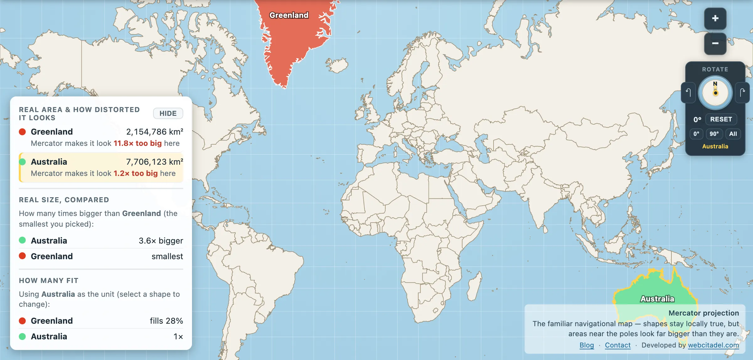
Most of what this site does is catch a specific map telling a specific lie. Underneath all of it is a general result, proved nearly two centuries ago, that says the lying is compulsory.
No flat map of the Earth can be correct. Not “we haven’t found a good enough one yet”. Not “it’s a tricky engineering problem”. It is mathematically impossible, and Carl Friedrich Gauss proved it in 1827.
The Theorema Egregium
Gauss called it the Theorema Egregium — the Remarkable Theorem — and he was not usually given to self-promotion.
The theorem concerns Gaussian curvature, a number you can calculate at any point on a surface. Gauss showed that this number is intrinsic: it can be measured entirely from within the surface, by an ant walking on it and taking measurements, without any reference to the space the surface sits in. And crucially, it cannot change if you bend the surface without stretching it.
A sphere of radius R has Gaussian curvature 1/R², which is positive everywhere. A flat plane has Gaussian curvature zero. Since bending alone can’t change curvature, there is no way to lay a sphere flat without stretching, tearing or squashing it — which means without changing distances, areas, or angles. The two surfaces are not related by any bending.
That’s the whole thing. Every world map you have ever seen has distortion baked in as a mathematical necessity, before anyone makes a single design decision.
Two everyday demonstrations of the same theorem:
The orange peel. Peel an orange in one piece and try to press the skin flat on a table. It splits. Push the splits together and the peel buckles. That’s the theorem, in fruit.
The pizza slice. Gaussian curvature is the product of how much a surface bends in its two principal directions, and for a flat slice that product is zero. Bending is not allowed to change it. So the moment you curl the crust upward, the slice is forbidden from also bending downward along its length — one direction is curved, therefore the other must stay rigid. The tip stops drooping. Everyone who has ever eaten a slice standing up has used Gauss’s remarkable theorem to keep the topping on.
So every projection is a choice
If distortion is compulsory, the only question is which kind you accept. Projections fall into families depending on what they choose to save:
- Conformal — preserves angles and local shape, at the cost of area. Mercator is the famous one, and the cost is a Greenland drawn about twelve times too large, so that an island a quarter of Brazil’s size arrives on the page looking like its equal.
- Equal-area — preserves area, at the cost of shape. Equal Earth, Mollweide, Gall–Peters. Countries are the right size; some of them look squashed or sheared.
- Equidistant — preserves distance, but only from one or two chosen points. The UN emblem’s azimuthal equidistant map is correct for distances from the North Pole and nowhere else.
- Compromise — preserves nothing exactly and spreads the error around so nothing looks too bad. Robinson, Winkel Tripel (used by National Geographic since 1998), Natural Earth.
There is no fifth option where you keep everything. Anyone selling you a map without distortion is selling you a globe.
Which distortion you should accept
Depends entirely on the job, and that’s the honest answer rather than a dodge.
Navigating a ship with a compass? Mercator, and it’s not close — a constant bearing is a straight line on it, which is exactly what a sixteenth-century navigator needed. Comparing the size of countries? Anything equal-area, and Mercator is actively disqualified. Showing the world’s shape at a glance in a textbook? A compromise projection, because the human objection to Africa looking sheared is real even if it isn’t mathematical.
The failure isn’t using Mercator. It’s using Mercator — a navigation chart — as the default backdrop for every world map in every classroom, newsroom and web app, and then reasoning about the size of countries from it.
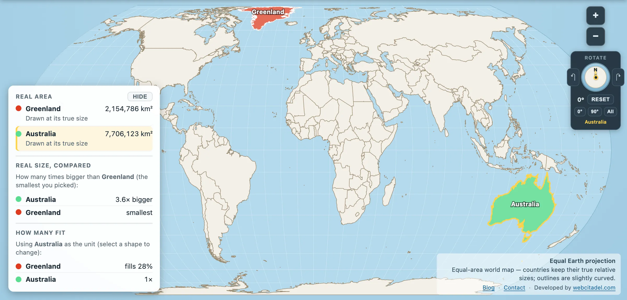
The same shapes on Equal Earth, where every square kilometre is drawn the same size wherever it sits. This is the honest version.
See two lies at once
Open compare mode with Mercator against Equal Earth, Greenland and Australia loaded on both.
On the left, Greenland is a monster and Australia is modest. On the right, Australia is 3.6 times the size of Greenland, which is the truth. Same data, same shapes, same instant — two projections, two irreconcilable pictures.
Neither is wrong by accident. Gauss proved they had to be.