
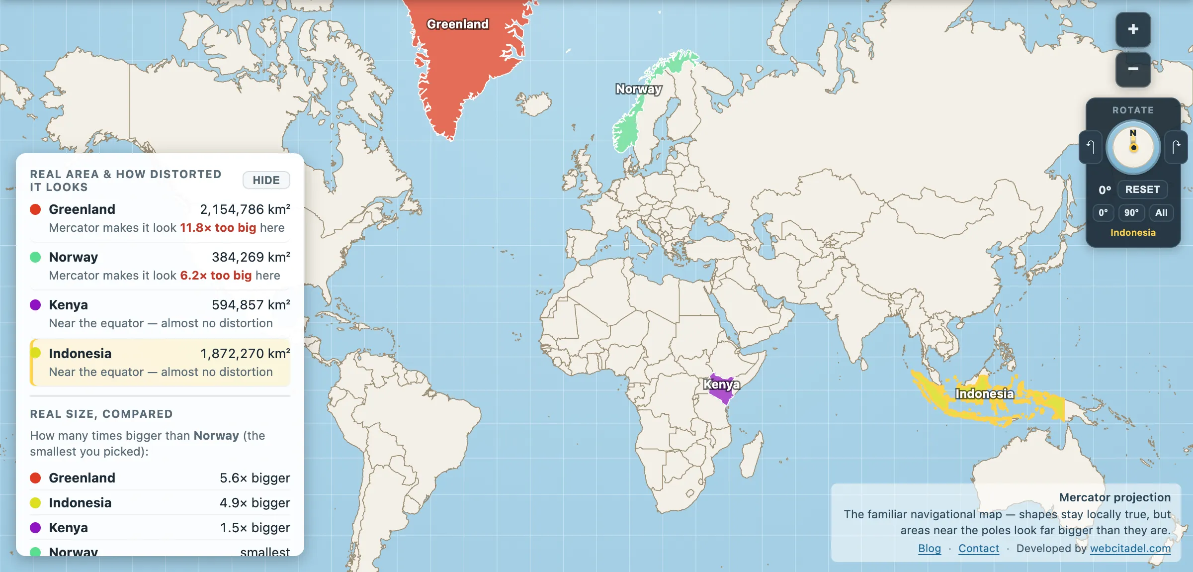
Mercator’s distortion is not vague, not a matter of opinion, and not hard to calculate. It follows a single formula, and once you have it you can work out exactly how much any place on Earth is being flattered.
Area exaggeration = 1 / cos²(latitude)
That’s it. The projection stretches east–west by 1/cos(latitude) to keep the meridians parallel, then has to stretch north–south by the same factor to keep angles correct. Two stretches, multiplied, gives the area factor.
The latitude table
| Latitude | Drawn this many times too big |
|---|---|
| 0° (equator) | 1.00× |
| 20° | 1.13× |
| 30° | 1.33× |
| 40° | 1.70× |
| 50° | 2.42× |
| 60° | 4.00× |
| 70° | 8.55× |
| 80° | 33.2× |
| 85° | 132× |
Note how brutally it accelerates. From the equator to 40° the penalty is modest. From 60° upward it goes vertical, and past 85° it runs to infinity — which is why Web Mercator simply cuts the map off there.
The countries
Applying that to the centre of each country gives the rough exaggeration for the shape as a whole. The worst offenders, in order:
| Country | Centre latitude | Roughly |
|---|---|---|
| Greenland | 73° N | 12× too big |
| Norway | 66° N | 6.2× |
| Russia | 66° N | 6.1× |
| Iceland | 65° N | 5.6× |
| Finland | 64° N | 5.3× |
| Sweden | 62° N | 4.7× |
| Canada | 60° N | 4.1× |
| United Kingdom | 54° N | 2.9× |
| Germany | 51° N | 2.5× |
| United States | 45° N | 2.0× |
| China | 37° N | 1.6× |
| India | 23° N | 1.2× |
| Nigeria | 10° N | 1.03× |
| DR Congo, Indonesia, Kenya, Ecuador | ~0° | 1.00× |
And the southern hemisphere, which gets the same treatment because the formula only cares about distance from the equator:
| Country | Centre latitude | Roughly |
|---|---|---|
| New Zealand | 42° S | 1.8× |
| Argentina | 35° S | 1.5× |
| South Africa | 29° S | 1.3× |
| Australia | 26° S | 1.2× |
| Brazil | 11° S | 1.04× |
What the table is really saying
Two things jump out of it.
The winners are all in one place. Every country drawn more than twice its true size is in northern Europe, northern Asia or northern North America. Greenland, Norway, Russia, Iceland, Finland, Sweden, Canada — plus the UK and Germany just over the line. This is the pattern that made the Peters argument land: the default world map of the last four centuries systematically inflates one band of latitude, and it happens to be the band that drew the maps.
The losers aren’t shrunk — they’re just not enlarged. Equatorial countries sit at 1.00×, exactly right. Nothing is done to Indonesia, DR Congo, Kenya or Ecuador. But when everyone at 60° north gets multiplied by four and you don’t, you lose the comparison anyway. This is how Africa ends up looking comparable to Greenland instead of fourteen times bigger.
The asymmetry between the hemispheres is worth noticing too. There’s very little land at high southern latitudes — Chile, Argentina and New Zealand taper away and then it’s ocean until Antarctica. So Mercator’s most extreme inflation lands almost entirely on the northern half of the map, with Antarctica smeared unusably along the bottom edge as the only southern casualty.
Watch the number move
Open Greenland, Norway, Kenya and Indonesia on Mercator. Each shape carries a live "× too big" readout, calculated for wherever it currently sits.
Now drag Greenland south. Watch the multiplier fall from double figures towards 1.00 as it approaches the equator, and watch the shape shrink to match. Drag Kenya north into the Arctic and watch it inflate into something continental.
The number in the app is the table above, computed continuously. Same formula, every frame.
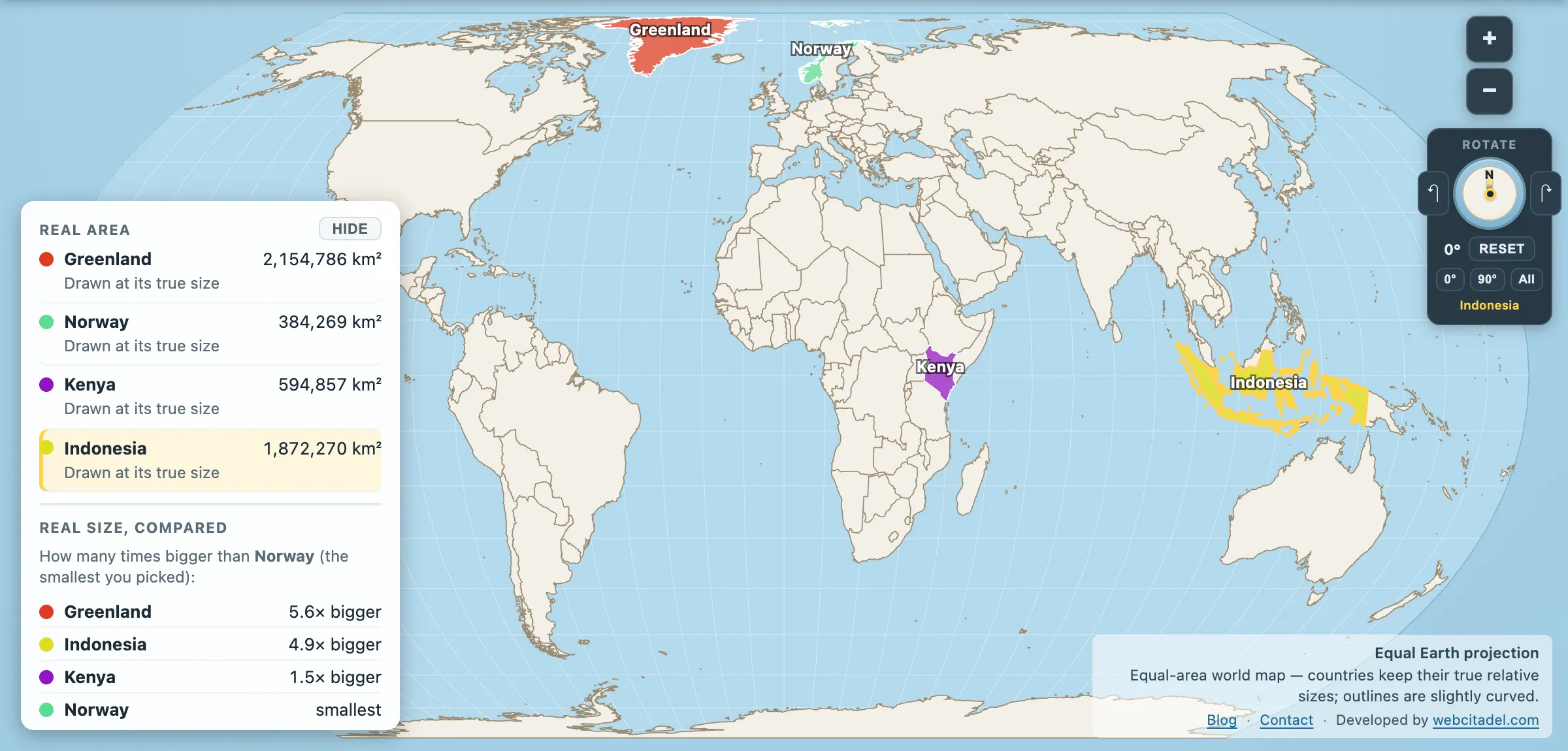
The same shapes on Equal Earth, where every square kilometre is drawn the same size wherever it sits. This is the honest version.
Sources & methodology
- Area exaggeration is 1/cos²(φ), the standard Mercator area scale factor. The country figures evaluate that at each country’s geometric centroid, which is an approximation — large countries spanning many degrees of latitude (Russia, Canada, Chile) are distorted by a range of factors across their own territory, not one.
- Centroids are computed from the app’s country dataset. The USA figure includes Alaska, which pulls it north.