
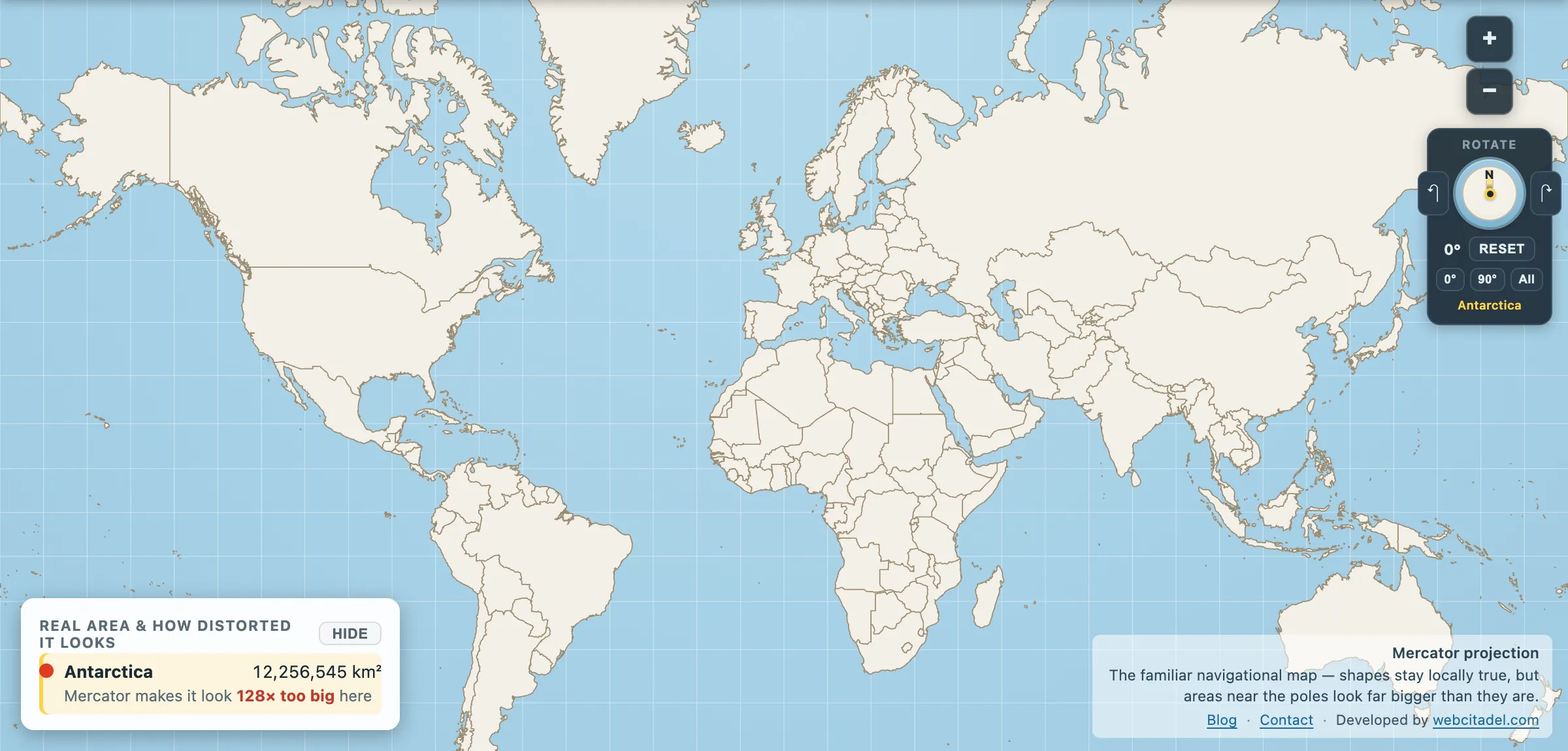
Open a slippy map — Google, Bing, OpenStreetMap, anything with tiles — and scroll south as far as it will go. You don’t reach the South Pole. You reach a grey nothing at around 85 degrees and the map refuses to continue.
That’s not a bug, an oversight, or a licensing problem with Antarctica. It’s arithmetic.
Mercator’s edge is infinity
On a Mercator projection, the distance from the equator up the page grows without limit as you approach the pole. The formula involves the natural logarithm of the tangent of half the co-latitude, and at exactly 90° that expression diverges. The pole is infinitely far up the page. You cannot draw it, no matter how large the paper.
So every Mercator map ever printed has stopped somewhere short and hoped nobody asked. The interesting part is where the web decided to stop, and why.
Why 85.05113°
Web maps are built from square tiles in a pyramid: one tile at zoom 0, four at zoom 1, sixteen at zoom 2, and so on. For that to work cleanly the whole world has to be a square — same extent north-to-south as east-to-west.
Longitude spans 360°. So the map has to be cut at whichever latitude makes the vertical extent match. That latitude is:
arctan(sinh(π)) = 85.05112878°
Cut there and the world is a perfect square, tiles subdivide forever without seams, and every zoom level lines up with the one above it. The number isn’t arbitrary and it isn’t rounded — it’s whatever π forces it to be.
The cost is everything above 85° north and below 85° south. Which, on the southern side, is most of Antarctica.
The other thing Web Mercator quietly does
There’s a second oddity worth knowing. Web Mercator treats the Earth as a sphere for the projection maths while using WGS84 ellipsoid coordinates for the positions. Mixing the two means the result is not strictly conformal — it fails the one mathematical property Mercator exists to provide.
For displaying a road on a phone the error is irrelevant. For surveying it is not, which is why Web Mercator is not used for authoritative work, and why the EPSG registry initially declined to give it a code at all before eventually assigning 3857. The most-used projection on Earth is, formally speaking, a hack that got standardised because everyone was already using it.
The bigger practical consequence is the one this site exists for. A generation has now grown up with a Mercator map as the default interface to the planet — not on a classroom wall, but in a pocket, consulted daily. All the latitude-dependent inflation that made Greenland look bigger than Brazil is still there, now with turn-by-turn directions on top of it.
Which is why Google added a globe
In August 2018 Google Maps changed how it renders at low zoom levels on desktop: zoom far enough out and the map stops being a rectangle and becomes a 3D globe. Greenland shrinks to its real proportion in front of you.
That’s a tacit admission of exactly the problem. Mercator is a fine choice at street level, where you’re looking at an area small enough for the distortion to be negligible and you want north up and angles correct. It’s an actively bad choice for the whole planet. So the product now uses one at one end of the zoom range and the other at the other end.
Same conclusion this app reached with its own globe view. There is no flat map that gets everything right, so the trick is to switch projections when the job changes rather than pretend one can do everything.
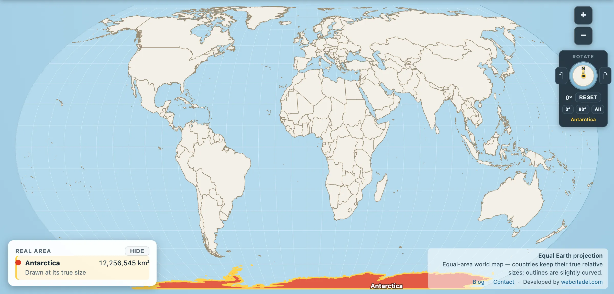
The same shapes on Equal Earth, where every square kilometre is drawn the same size wherever it sits. This is the honest version.
See the edge for yourself
Open Antarctica on Mercator and look at what happens: a continent of 12.3 million km² smeared into an unreadable band across the bottom of the map, wider than the whole world it belongs to.
Then switch to the orthographic globe or an azimuthal equal-area projection centred on the pole, and Antarctica reassembles into what it is — a compact landmass bigger than Australia, and 270,673 km² short of China and India combined.
Web maps cut it off at 85° because they had to. You don’t have to.