
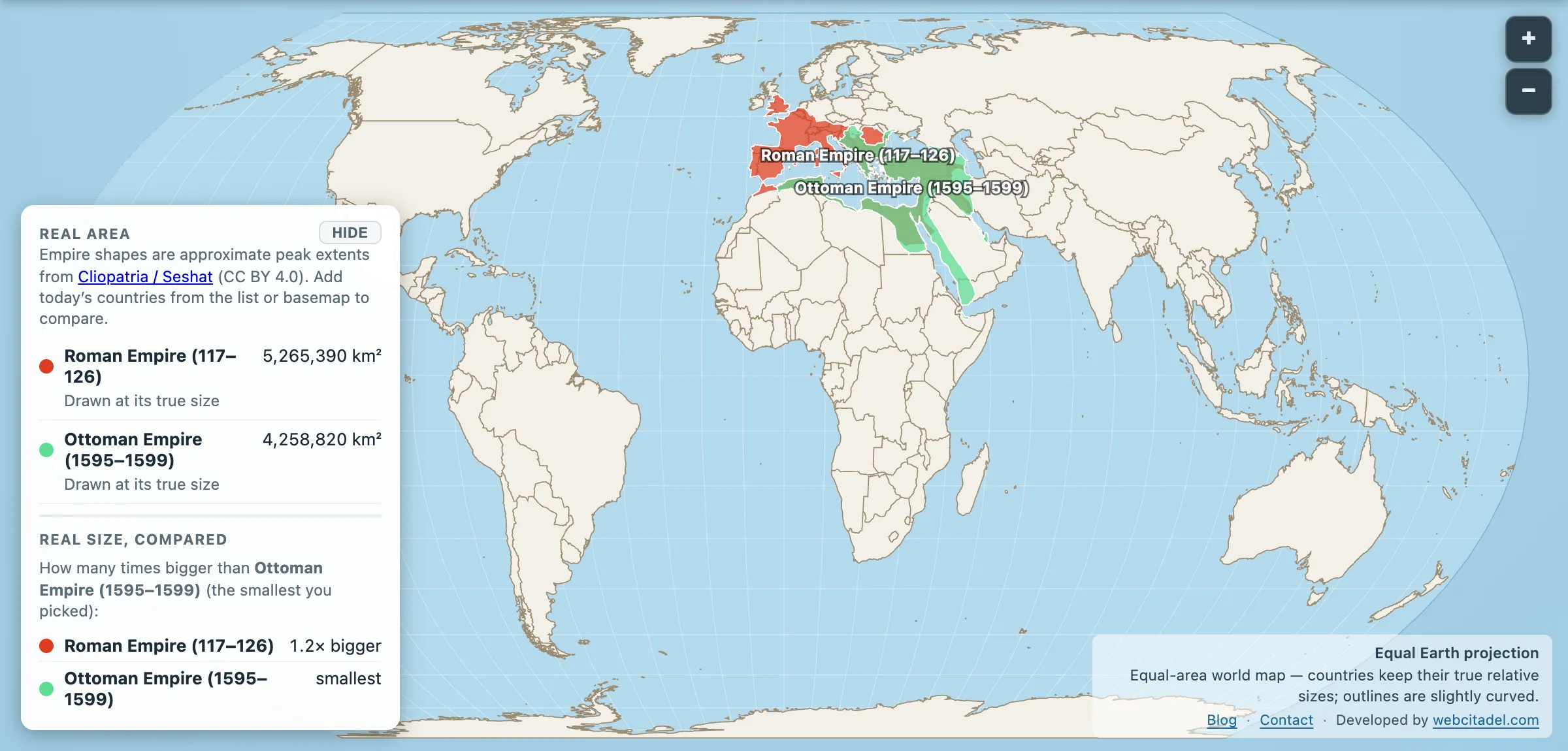
Rome is the default ancient empire. The Ottomans are the default “actually they lasted longer” correction. Put them in the same sentence and people assume the later, longer-lived machine must also have been larger.
The honest answer is that it’s close enough to be an argument — and closer than this app’s own map makes it look.
- Roman Empire at its peak under Trajan, 117 AD: 5,265,390 km²
- Ottoman Empire as drawn here, 1595–1599: 4,258,820 km²
- Ottoman Empire at its actual maximum, 1683: roughly 5,200,000 km²
That third line is the one that matters, and it isn’t the shape you can drag on the map. Compare like with like — each empire at its true greatest extent — and Rome’s lead shrinks from a million square kilometres to something inside the margin of error of the reconstructions themselves. On the conventional figures widely used for both, the Ottomans nose ahead.
Why the map shows a smaller Ottoman Empire
The empire shapes here come from Cliopatria, and the Ottoman snapshot in that dataset is the late sixteenth century — Murad III’s empire, after Hungary and before the eastward push into Mesopotamia was consolidated. It is a real Ottoman Empire. It just isn’t the biggest one.
The maximum came in 1683, stretching from Buda in central Hungary to Basra on the Persian Gulf, from the Crimean steppe to the Algerian coast. It lasted about eight weeks. Kara Mustafa Pasha laid siege to Vienna in July, was routed on 12 September 1683 by a Habsburg–German–Polish relief army, and the sixteen years of war that followed ended at Karlowitz in 1699 with Hungary and Transylvania gone.
So the Ottoman peak is a genuinely awkward thing to put on a map: an empire at full extent for less time than a school term.
Same neighbourhood, different centuries
Stack the shapes and the overlap is the story. Both empires wanted the eastern Mediterranean, the Balkans, Anatolia, the Levant. Rome pushed farther into western Europe and North Africa’s Atlantic edge. The Ottomans pushed deeper into the Middle East, Arabia and up toward the gates of Vienna. One faced the Atlantic. The other faced the Indian Ocean trade.
Longevity is where the Ottomans strike back. The Roman state in the east staggered on as Byzantium for a thousand years after the west fell, and the Ottomans then sat on much of that world into the twentieth century. Area is a snapshot. Duration is a lifestyle.
Measure the snapshots anyway
Open Ottoman vs Rome on an equal-area map. Drag one over the other. Watch the Mediterranean change landlords without changing size — and remember you are looking at the Ottomans in 1595, with another 900,000 km² still to come.
And for the wider league table: neither makes the all-time top tier. Persia already beat Rome, and Han China matched it at the other end of the Silk Road. Britain and the Mongols were playing a different sport entirely.
Rome wins the brand. The Ottomans win the endurance event. On square kilometres it’s a photo finish, and anyone who tells you otherwise is quoting one source and not the other.
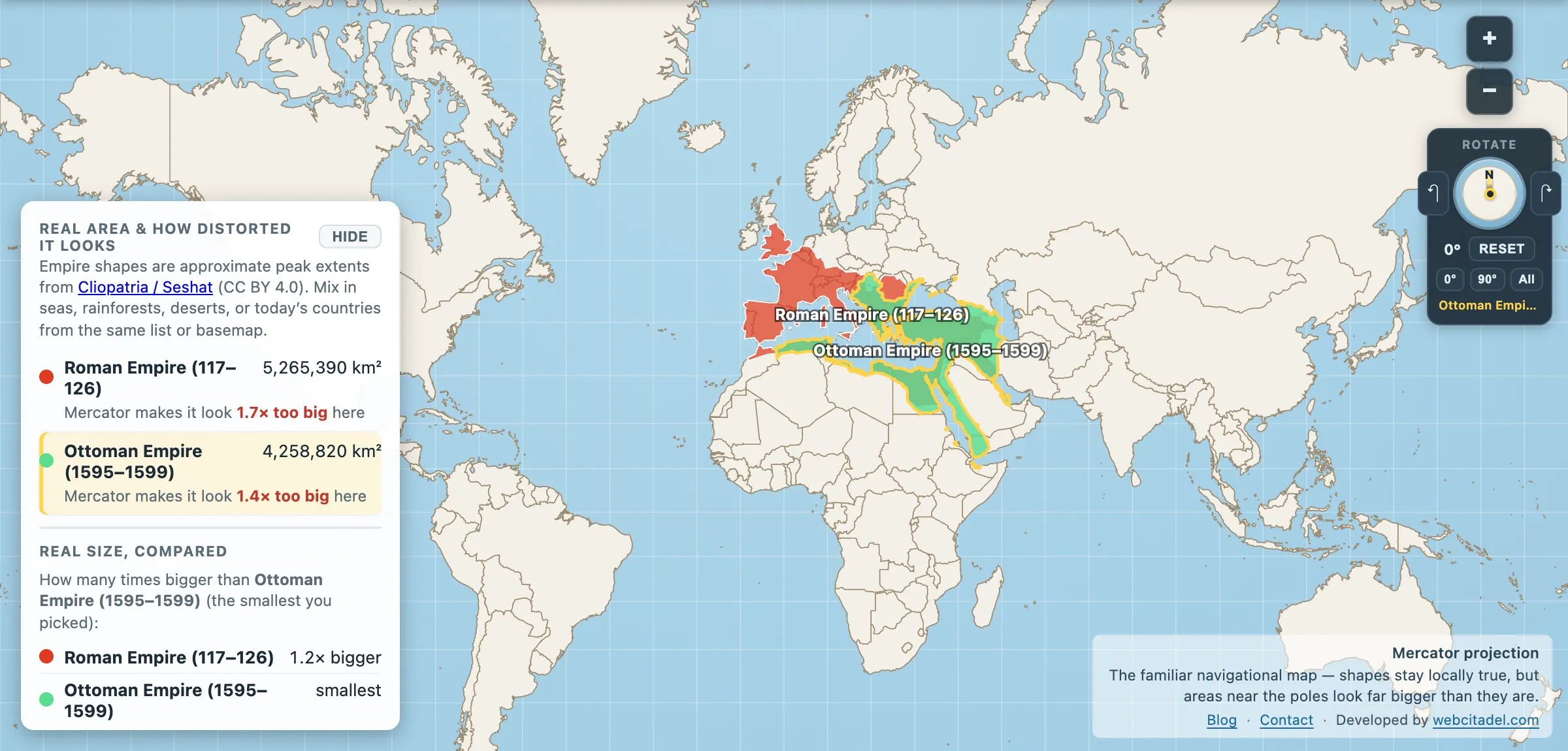
The same shapes on Mercator — the projection almost every map you see uses. Watch what it does to anything far from the equator.
Sources & methodology
- Empire extents: Cliopatria (Seshat Global History Databank), CC BY 4.0, as used in Map Real Size. The Ottoman feature is a 1595–1599 snapshot, which is not the empire’s maximum — the 1683 peak of roughly 5.2 million km² is the figure conventionally quoted, and is the one used in Map Real Size’s own quiz.
- Peak extents are reconstructions, not surveys, and the gap between Rome and the Ottomans at their respective maxima is smaller than the disagreement between sources. Treat “which was bigger” as genuinely open.