
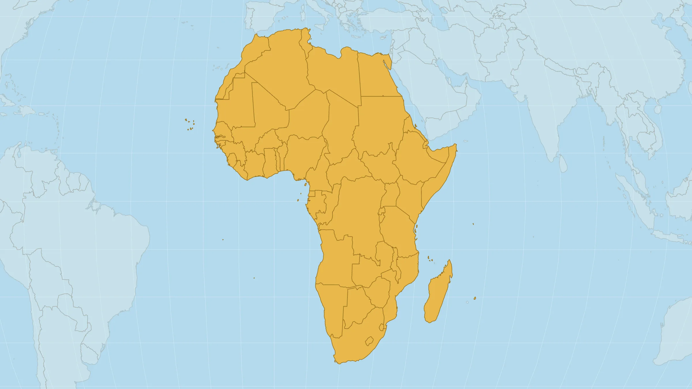
On 4 September 2026, the United Nations General Assembly voted on a cartographic habit that has quietly undersold one continent for generations: on the world maps most of us grew up with, Africa looks far smaller than it is.
The resolution — titled Correct the Map — passed 164 to 1, with six abstentions. Led by Togo for the African group, it asks governments, schools, international organisations and technology companies to prefer equal-area projections when the point is how big places really are. It names Equal Earth in particular.
The United States cast the only vote against. France co-sponsored the text and said its foreign ministry would stop using Mercator for diplomatic world maps. The resolution is non-binding. It does not ban Mercator, and it does not impose a single official map. It simply says: when Africa’s size is the question, stop answering with a navigation chart.
How big is Africa, really?
About 30.4 million km².
That is large enough for the United States, China and India to fit inside together — about 22 million km² between them — with millions of square kilometres still spare. The Sahara alone is roughly the size of the United States; it is only the dry strip at the top.
Open that comparison on the map, or read the full write-up.
Why the old map made Africa look small
Gerardus Mercator drew his projection in 1569 for sailors. On his chart, a constant compass bearing runs as a straight line. For navigation, that is still useful.
The trade-off is area. The further land sits from the equator, the more Mercator stretches it. Places in the far north — Greenland is the famous example — can look roughly ten to fourteen times too big. Much of Africa sits near the equator, so it is drawn closer to truth. On the same wall map, an island of about 2.2 million km² can look like a peer of a continent fourteen times larger.
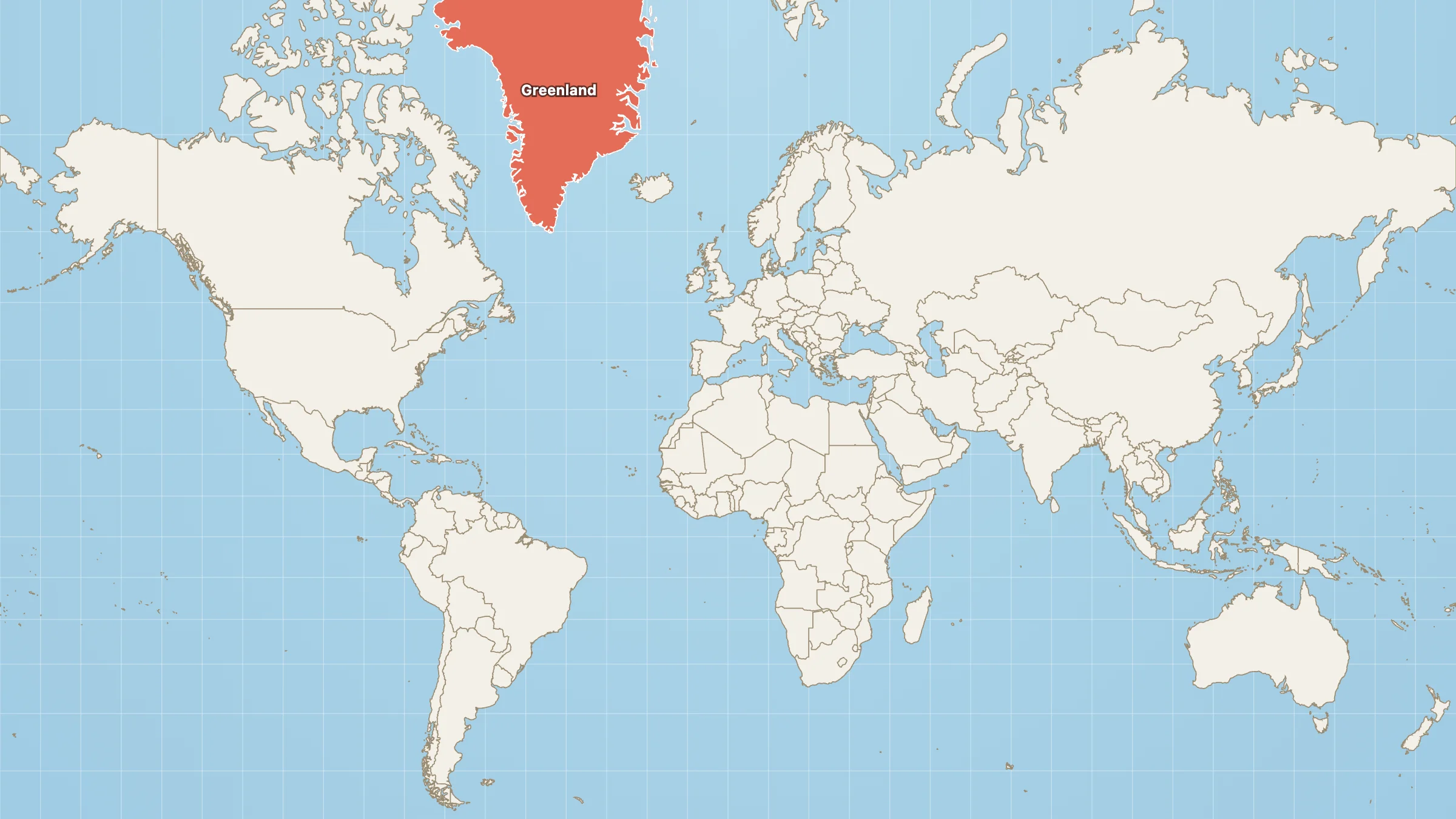
Mercator, with Greenland lit up. This is the classroom default — and the reason Africa spent so long looking “medium.”
French Foreign Minister Jean-Noël Barrot put the distortion in plain language on the day of the vote: Greenland “appears almost as big as Africa, whereas Africa is actually about fourteen times larger.”
Mercator was never trying to shrink Africa. It was trying to keep bearings straight for ships. The confusion came later, when a navigation chart became the default picture of the world in classrooms, newsrooms and apps — and Africa absorbed the visual cost.
What Equal Earth is
Equal Earth was published in 2018 by Bojan Šavrič, Tom Patterson and Bernhard Jenny. It keeps relative areas honest, while aiming to look less stretched than older equal-area maps such as Gall–Peters. That mix of accuracy and readability is a big reason the African Union preferred it, and why the UN text points to it by name.
France is dropping Mercator for equal-area diplomatic maps; reporting on the switch has named Eckert IV, a 1906 equal-area projection in the same family. On Map Real Size you can use Equal Earth, Mollweide or Gall–Peters when you want honest sizes, and keep Mercator when you want the familiar navigation view.
If you want the longer story behind Gall–Peters, there’s a separate piece on that debate. And if you’re curious why every flat map has to distort something, Gauss’s theorem is the short answer.
Try it
Equal Earth · Mercator next to Equal Earth · USA + China + India on Africa
The UN vote is asking institutions to match the map to the question. If the question is Africa’s size, Equal Earth — or another equal-area view — is the clearer choice.